
Fines Migration and It's Effects On Temperature in the Coffee Puck

Home-made dual probe Thermocouple
BY CLAY BUSH
Many times, I have read articles, or seen coffee makers playing with temperature in their machines by the smallest of margins, sometimes 0.1 degree in order to get the flavour they desire from their coffee. But does that temperature change actually make a difference? And if so, is it the most dominant factor in temperature change?
Measuring coffee puck temperature has been limited to group handles that are one of two basic designs.
The first, is a temperature probe surrounded by some material, (often rubber) to simulate the coffee puck. When the group is in place, the machine is activated and then the water is run over the composite material and through a flow regulator, on the base of the group, that mimics shot time run speed. These group handles work with the composite forming a “heat sink” of sorts which is meant to maintain the puck temperature. Unfortunately, what temperature you’re actually getting is that of the heat sync. These tools only check the temperature of the water coming from the machine. Not puck temperature. Incidentally, if you want to check the temperature of your water coming from the group head, I would probably test that directly and not introduce another factor to distort the figures.
The second, and perhaps more reliable type of thermocouple, is often a back-yard design where roasters, or coffee makers drill into a basket stick a temperature probe through it and then make a coffee out of the sample thermocouple to give them a temperature of the puck itself. A much better design over its predecessor, however the placement of this probe can often give misleading, or one-dimensional results. So how do we get accurate puck temperature measurements?
Just over ten years ago my brother asked me a question regarding something to do with puck temperature. In truth I can’t even remember what the question was, all I remember is that to answer it we had to create a group handle with a double thermocouple probe. A basket with one probe at the top of the puck/basket and one at the bottom.

Double probe thermocouple
By having two probes we could determine temperature differentials and compare two sets of data. When doing so, I got results I didn’t expect, and this group in many ways what made us look at coffee in a different way. We have continued to use this testing configuration over the last ten years to monitor different machines, grinders and basket designs, and it has contributed, and or confirmed, a range of understandings we now rely on with equipment that we have developed.
This article is an attempt to try and illustrate and distil those results into a basic, but still comprehensive view of what happens when water is introduced to the coffee during an espresso extraction. I should say as well that I have added my/our opinions to this article to try and give some insight as to what the figures mean. Occasionally we may express a view that some people will immediately dismiss because it does not fit with their understanding, and that’s Ok. Our view is governed only by the laws of Physics and each of these articles tries to explain this, but they must be understood all together. The extraction process in espresso is a complex matrix and each dynamic is related. Try to keep an open mind and see what ideas you draw parallels with.
Explanation of a Standard Graph
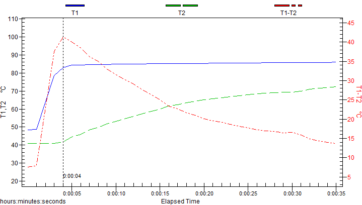
Graph 1. A standard coffee shot representation
This graph represents a coffee made on a Synesso Hydra, with a Mahlkonig EK grinder. The coffee was a single origin Brazil medium roast, 20.4-gram dose, 50gram brew mass, over 29 seconds. The shot produced an 8.4% TDS, and 20.9% extraction yield. All in all, a pretty generic shot.
Explanation of the graph
The left hand vertical scale, on the graph highlights the temperature reading of the probes in °C, whilst the bottom horizontal Scale is the shot time recorded in seconds.
The blue line (T1) is the top temperature probe. This probe is placed about 1 millimetre under the puck surface. It’s positioned to measure the water temperature coming into the top of the puck.
The green line (T2) is the bottom temperature probe. It is placed about a millimetre inside the base of the basket, as a last recording before the coffee leaves the puck.
The righthand vertical scale is for the red line which is the differential between the probes T1 & T2.
On each of the graphs one will notice some differences in the start temperature of both T1 & T2. The reality is that these temperatures should normally display the Coffee temperature but occasionally preparation of the basket prior to tamping and ensuring probe placement is correct will show differences between the two probes. We are focussed on what happens when the extraction process begins, and as such are only concerned with data from the commencement of temperature rise in T1, signalling the commencement of the extraction process.
In Graph 1. The shot at 1 second after recording starts for the top probe and levels off about 5 seconds later at about 84 degrees. This 4 second period, is a reflection of restrictors, pressure, headspace etc. And will vary depending on the machine setup. The green line, (bottom of the puck) lies idle for longer and generally starts to rise when the top temp stabilises. This delay indicates it took 4 seconds for the water/coffee to travel through the puck and exit the basket. This line reflects basket Density, roast degree, puck preparation technique and machine setup.
The red line is the difference in temperature between the two. Its scale is recorded on the right-hand side in red. You will notice that when the first drops of coffee come out from the basket after five seconds, this red line records a temperature difference of 40 degrees. That basically means there is a wash off of 40 degrees in temperature between the top of the puck and the bottom. As the temperature of the coffee in the bottom of the puck rises throughout the shot duration, the wash-off decreases and the temperature difference becomes closer together till the finish of the shot where the temperature difference is 14 degrees.
That means in this example, that your minimum temperature differential in the puck is 14 degrees.
At a 30-second shot pour, this is a pretty typical shot that is being poured the world over. So, if you think that you are getting stable puck temperature in your coffees you may not be.
Temperature and Grind
This temperature differential is manipulated by grind. Whilst the top blue line will remain constant as this is indicative of your machines ability to deliver stable water temperature. The lower green line is manipulated by grind. The finer you grind your coffee the slower the temperature rise. The courser the grind the faster the rise.

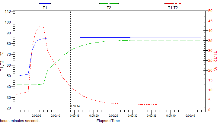
Graph 2. The grind changed courser.
In Graph 2 above, the grinder, machine and basket are the same as Graph 1. However, the grind was opened up courser, and it has given the shot a 2 second stabilisation time, with the lower temperature starting to climb one at this point. By opening up the grind and making it courser, we have decreased the density in the puck, and creating less resistance for the water by opening up the gallery space between grind particles. As a result the water passes quicker through the grounds towards the bottom of the basket. Making the temperature come together quicker. The TDS and Yield %'s are similar to the prior test, however the puck temperature is more consistent in this graph with a difference between the top and bottom of the pick of only 7 degrees. Not 14 Degrees as in Graph 1.
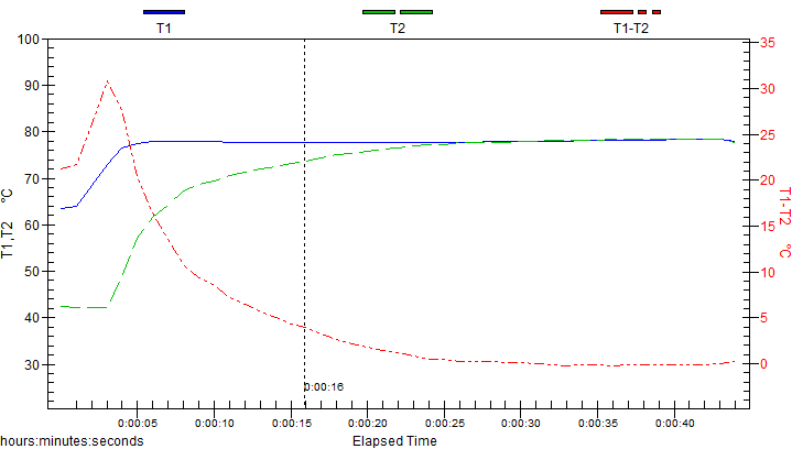
Graph 3. Triple baskets 24gram.
In Graph 3 above, the dose and basket have been changed up to a 24 gram, and it has been ground by a Fiorenzatto F71 conical grinder. We can expect that this particle size would be different to the EK, which is reputable for it’s clean cut. In this graph the temperatures come closer together still and at a much quicker pace. But something else is at play here. With bigger baskets there is more expansion of coffee, as the head space prior to extraction is greater. This extra headspace makes for even greater galleries, and allows even more movement between the particles. The puck temperature is now only 4 degrees different and has been maintained for a longer period during the shot pour.
Basket shape and temperature in the puck.
For those who are avid readers of our articles you will recall in the last one we discussed basket shape effects on extraction. The next two graphs are those same two resulting baskets with the temperature probes attached. If you haven’t read this article, I suggest you do so at a later stage and come back to the next two graphs, as they will further develop your knowledge about basket shape. In the article, both baskets had the same extraction chamber volume (for explanation of what extraction chamber volume is, and how to determine it click here). In short, although both baskets in the article held the same coffee volume, the article (amongst other things) discussed extraction rates and how they differ depending upon basket wall shape (ie. A straight walled basket must be run at a finer grind, than a tapered wall basket, which leads the straight walled basket to have a greater puck density) Those of keen intellect have probably already determined what the resulting graphs will look like. The straight wall basket because of a finer grind will have a slower temperature rise and the tapered wall, a faster one. See graphs 4a and 4b below. It should be noted in the graph that the examples are over extracted so comparisons are slightly off. (Sorry about that, it’s hard-getting things exact when you’re "driving” this double probe thermocouple, too many buttons, and stop watches to press at once. ☹)
Because these two baskets run radically different, and the article was about puck dynamics we were forced to implement a time restriction to make the base of comparison, not TDS and Yield. (read article for a full explanation) In any case, for the sake of the graphs one of these baskets will be run to there potential and the other will suffer. In the comparison of these graphs the circumstances favour the straight walled baskets. Even with ideal conditions the straight wall records a puck difference of 10 degrees C. The tapered wall basket has only an 8 degree puck variance and a steeper base temperature. However at a 24% extraction yield on the tapered basket, it was clearly run too tight for too long. By opening up the grind on the tapered basket thereby bringing back the yield to 22 like the straight walled basket example pictured, the temperatures of the tapered wall basket will come together even quicker. Making a sharper rise in the bottom probe. This means tapered baskets will provide more temperature stability in the puck than a straight walled basket.

Graph 4a The tapered basket from article.

Graph 4b. The straight walled basket.
Now back to matters at hand….
Is it possible to bring the two temperatures together so they meet, and give a constant puck temp throughout?
Yes! To illustrate though, I have to go into old stock file graphs. Because some of the following graphs are over 8 years old, I can’t always tell you what grinder they were taken on, what machine, coffee, or even the tds and yields. So, whilst these are actual results, we will have to use them as guides only. I’ll add information as I know it.
Graph 5. Heat exchanger machine, no restrictors, possibly a Mazzer super jolly grinder.
In Graph 5, the two temperatures meet and stabilise at 25 seconds. In my view this is preferable. I can’t say what grinder was used. But it definitely wasn’t an EK, at a guess…. Probably a Mazzer super jolly. The machine though, was a Vibiemme single boiler heat exchanger. This can be seen by the bottom probe starting to rise before the top has stabilised, and also the speed it is rising. This is a trait of old school heat exchanger machines with different flow restrictor setups. Flow restrictors found in most standard LM, Synesso, Slayers, etc. restrict water flow making for a longer pre-infusion. Thereby making the second probe uptake slower. In old heat exchangers, flow restrictors are used in a different way because of the thermal syphon loop temperature instability. They will typically have higher flow rates which will saturate the puck quicker and also cause temperatures to rise and stabilise quicker. This would have also been a tapered basket, which would have allowed the grind to open up. The above combinations have allowed the temperatures to meet and stabilise. At 50 seconds, this was a long pour, and I would have normally stopped at 30 seconds. I imagine I only let it pour so long in order to check temperature stability. Not for yield calculations. Going back 10-15 years ago, coffee makers on the machinery of the day would run a general rule of "1 millimetre/ 1 second." This graph is a classic "1 ml 1 second" representation .
Can the temperature in the base of the puck, ever exceed the top temperature?
If there is only one graph you remember in this entire article it should be the next one.

Graph 6. When it all goes wrong; Grind too fine, fines migration, blunt burrs, under dosed.
Out of all the graphs I have saved, this is by far the worst. I have included it, because there’s a lot to learn when things go wrong. This graph will give you more insight into coffee than any of the others. As a result, we’ve gone into extra depth to explain what has happened.
I’ve given both mine and jakes commentaries separately. (we don’t always agree)
Jake Bush's commentary on Graph #6.
This graph illustrates an under dosed puck with too course a grind.
The rate of change in temperature between the 2 probes has exceeded parallel indicating that temperature migration through the puck was very quick. The top temperature has in fact fallen away, producing the illusion that the bottom temperature has exceeded the top. This indicates that the puck has not swelled enough to displace the headspace void. Insufficient swelling allows finer particles to flow to the bottom of the puck quickly, imagine a fine slurry, enveloping the bottom probe to give a more stable temperature reading. Particle structure in this extraction was poor indicating potentially expired burrs as well, although this issue may be partially resolved with correct dose.
Clay Bush's commentary on Graph #6
1. The declining blue machine temp line (between 6 and 22 seconds) suggests a few things. That this graph is from a single boiler heat exchanger machine that has not been purged prior to the shot. And as a result, the temperature is not stable and its declining as the residual hot water is pulled from the heat exchanger, and fresh water is replaced. (note to self, always purge heat exchanger machines, to achieve constant temp. :P) and or this line has dropped low because there is no integrity in the rest of the puck and most likely under dosed. Also, the faster you run your shots the less integrity this top probe will/can hold. The slower you run your shots the flow rate decreases which can help to stabilise the top temperature.
2. The green and blue lines start twenty degrees apart, and for the first few seconds before the pump is activated the temperature is rising. (jagged blue line) This tells me the puck was in the machine for a while before the pump was activated. I think the group handle was in place 3 to 4 seconds before the Graph started recording. As a result, the puck has started to prematurely swell which is why the temp has started creeping up in the 0-2 seconds before the pump was activated. (note to self don’t leave the puck in the shower screen before pressing the button to start the shot ;P)
3. Because of this premature swelling of the puck with heat from the shower screen, the pre-infusion has now channelled which is why the pre-infusion stage (2 to 5 seconds on blue line) is stepped in stages and not a constant line.
4. There is a 2 second gap between the blue line activation and the green line activation, which tells me despite the channel that the grind was most likely on? But!.......
5. The green probe has risen very sharply. Not gradually like the graphs we have seen to date. Even the 1ml-1 second graph has not risen this sharply. I have only seen one instance of a bottom probe recording rises this fast. And that is with an old school lever machine. With a 12 bar initial pressure, they can bridge this gap faster than modern machines. However, this is not a lever graph, after checking the time stamp, we hadn’t started testing levers for another year. (lever graphs are an entirely different article) So that means………
6. The burrs are worn, and the water has moved too fast through the puck. When burrs are sharp, they slice coffee and open up a honey comb like structure which allows the water to enter these galleries. When cutters are dull, they roll and squash the coffee instead of slicing it. This prevents the water from entering the coffee and so it slides thru the puck faster. Here the grind has been tightened up to try and prevent this washing through (as mentioned in point 4) but without clean cut particles the water has taken the path of least resistance and channelled the shot. But that’s not all………
7. At 7 seconds the lines have crossed over, meaning that the temperature at the bottom of the puck is now higher than the top. How is that possible? Fines migration is the only plausible explanation we have come up with, as graphs like this only occur when grind distribution is questionable. I have never seen fresh burrs produce a graph like this. That tells me as the cutters wear, more fines are produced. These extra fines, cannot be contained in the puck because of the dull cut. So, they make their way to the bottom. In this case two negatives definitely don’t make a positive.
8. If we look at the temperature difference in the time stamp of this graph. the maximum temperature for T1 (top probe) is 88.9 degrees. The maximum temperature T2 (bottom probe) is 93.4 degrees. That means that the temperature has spiked in the bottom of the puck by over 4 degrees more than the water coming in from the machine?!?!?! Or at least it would appear that way. Unfortunately, without a third probe in the pipe above the head we cannot tell what the delivery temperature was. It was most likely higher than 93.4 degrees. But it is highly unlikely that an unknown volatile is present in the bottom of the puck which is generating it owns heat. This top reading could also be under reading because the puck is under dosed, perhaps reading the air temperature from the headspace in the puck and not water temperature.
Conclusions
I have chosen this sequence of graphs specifically in order to introduce you to temperature dynamic in the quickest possible way without overwhelming you with indigestible information. The truth is there are many more just like them, and they all have one thing in common. No two are the same. No matter how hard you try, even wasting time with .1-degree temperature programming or weighing coffee to .1 of a gram, you will not get the same result, every puck is different. The double probe thermocouple is a good tool as it shows results without taint or opinion. It’s just the facts. Unfortunately, it doesn’t give all the answers, but it does reflect the changes that the industry takes by giving a base line measuring tool to show results without bias. New baskets, machines, restrictors, pumps, pressure profiling, distribution tools etc. Can all be subjected to the group to see there effect, if any... It can also be used in conjunction with other tools to help you understand coffee better. (At the very least it will tell you when your burrs need replacing.)
After looking at hundreds of these graphs, the group has highlighted one thing for me, and that is that “fines” are a very important part of espresso extraction. (not that its practical to separate them anyway, so let’s get on with dealing with them) It’s our view that fines should not be feared or tried to be expelled. I believe they contribute to temperature stability in the puck. If you understand how fines react, you can control them by grind and dose, and If these are right, and cutters sharp, fines can be held within the puck and help stabilise/manipulate temperatures and work for you. If the grind is too course or cutters dull, they will migrate to the base of the puck and result in puck base temperature spikes, working against you. It’s a fine line.
But removing them gives flat temperature profiles. Nothing wrong with that if that is your intention, but how many knew this was the case? And if you did, what is your intention in doing this? Revisit graph 1. A classic temperature profile with a synesso and an EK. $25k worth of equipment. Now look at graph 5, $3k worth of equipment. Knowing what you now know, based on the graph comparisons, which coffee would you rather try? The Mahlkonig has a very clean cut and even particle distribution with generally less fines. But is that what we want in espresso? I am not against EK’s, as my brother Jake would say “An Ek is a collection of basic engineering principles done extremely well.” And you would be good to have one on your bench. But don’t put it there because someone said you should, what are you trying to achieve with it? Maybe a conical with a broader particle spectrum will be better for your application and flavour profile you want to achieve. Then again, maybe not.
These articles are designed to educate you, and empower you to make decisions and experiment for yourself. They are not designed to indoctrinate. By understanding different elements and how they fit together we can look to new ways to create coffee. More importantly focus on the matters that generate the most impact and consistency.
One final graph
Well, you made it to the end of the article. Congratulations! Now that all the latte artists are gone. I can give you a final quiz for making it this far. Can you guess what happened in this next graph? (Besides the fines migration of course.) If so comment on our Instagram post about this article with your answer. Unfortunately, we don’t have a blog. (not enough people care about what we’re doing yet to set one up. Hopefully soon.) First person to guess gets bragging rights. Wicked!

Graph 7. Can you guess what happened in this graph? (Besides the fines migration of course.) Leave a comment on our Instagram post about this article with your answer!
